UnBounce Editor: Distinguish between mobile and desktop with JavaScript
03/19/2020 (3739x read)
UnBounce is a practical, but often not very flexible editor for websites and landing pages: With it, individual pages can be clicked together with little effort. If you activate the mobile view, UnBounce distinguishes between desktop computers and mobile devices such as a smartphone or a tablet: You can also create completely different pages for both sizes.
However, you often want to know whether UnBounce is currently displaying the desktop view or the mobile version to the visitor: In addition to querying the screen size, this can also be checked with JavaScript via the size of the elements used by UnBounce.
UnBounce: Mobile or desktop view ?
You can display different elements for the mobile and the desktop view on the one hand. You can also change the position and size of the elements depending on the resolution: This just doesn’t work with text sizes, UnBounce can’t separate them. The only thing that helps here is a separate, mobile text block.

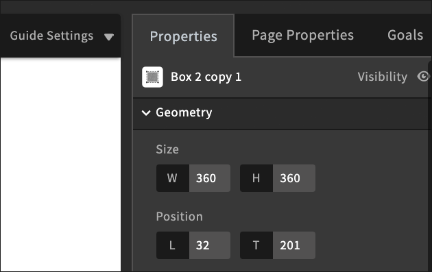
If a box has a width of 400 pixels in the desktop view, but only 200 pixels in the mobile view, you can query this value. The size is defined in the properties view on the right: once for the desktop view, then for the mobile view. Depending on whether the width of the box is now „400px“ or „200px“, UnBounce will then show the desktop or mobile version.
Important: This is not possible via the style property of the Box-ID itself: This is always displayed as empty. To read the values of an element, you should therefore use the functions „getComputedStyle“ and „getPropertyValue“!
does not work in UnBounce:
var width = document.getElementById('lp-pom-box-100').style.width;
Works with UnBounce:
var element = document.getElementById("lp-pom-box-100");
var width = window.getComputedStyle(element, null).getPropertyValue("width");
This value then contains the width of an UnBounce element together with the unit (for example „px“): This can then be used to check whether the mobile view or the desktop variant is displayed:
if(width == '200px') { alert('Mobile!') }
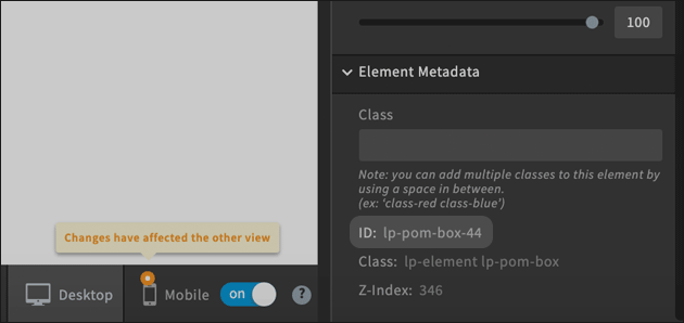
The ID of an element which can be used to read the value (in the code example above ‚lp-pom-box-100‘) is obtained by selecting the element: It can be found under „Element Metadata“ at the bottom right of the page:


